A landing page has one clear job: to guide visitors toward action. It is not there to tell your full company story, show every service you offer, or impress people with unnecessary design elements. The page should focus on the visitor’s intent and move them smoothly toward the one step you want them to take.
That sounds simple. In practice, most landing pages fail at it. They are cluttered with competing messages, buried CTAs, generic copy that speaks to no one in particular, and trust signals that are either absent or positioned in exactly the wrong place to do their job.
At Webtechnality, we design and build landing pages for businesses across industries. Every page we build is built around one principle: every design decision either removes friction or adds reason to act. When you apply that lens to every element on a page, the conversion rate follows. Here are the fifteen tips that make the biggest difference.
The median landing page conversion rate across industries in 2026 is 4.3 percent, according to Unbounce’s Conversion Benchmark Report. The top-performing quartile of landing pages converts at 11.5 percent or higher. The difference is almost entirely explained by design and copy decisions not traffic quality.
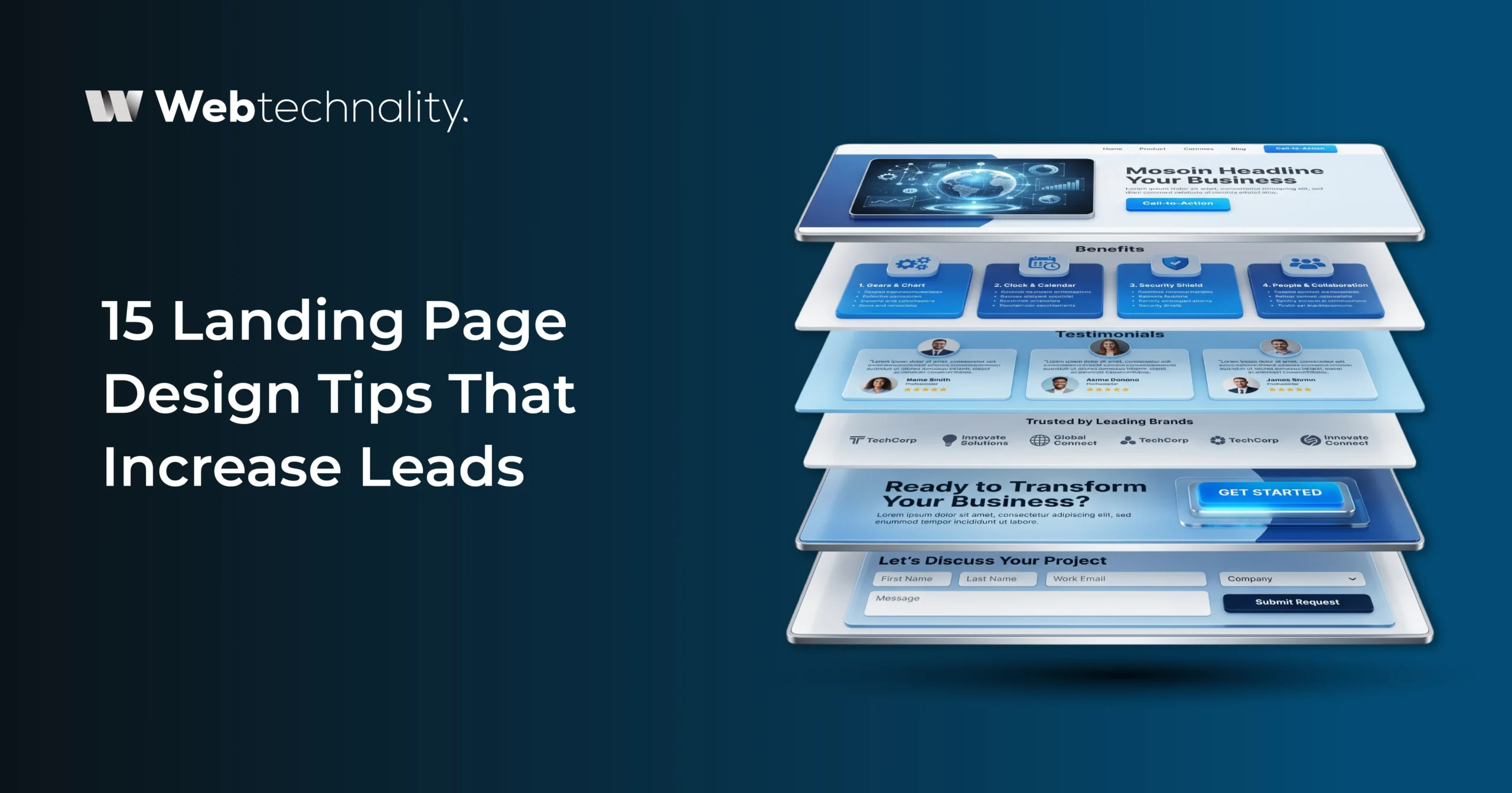
The Anatomy of a High-Converting Landing Page
Before diving into specific tips, it helps to understand the structural elements that every high-converting landing page shares. Think of these as the skeleton before the flesh.
| Section | Purpose | What It Must Accomplish |
|---|---|---|
| Hero Section | Capture attention and establish relevance | Answer “Is this for me?” within 5 seconds |
| Value Statement | Communicate the specific benefit of acting | Make the outcome concrete and desirable |
| Social Proof Block | Build trust and reduce skepticism | Show real results from real people |
| Benefits Section | Answer “Why should I choose this?” | Speak to outcomes, not features |
| Objection Handling | Preemptively remove hesitation | Address the top 3 reasons visitors do not act |
| Primary CTA | Direct the visitor to act | Single, specific, benefit-led action statement |
| FAQ Section | Eliminate remaining questions | Remove the last barriers to conversion |
Every element on your landing page should map to one of these structural roles. If an element does not serve a conversion purpose, it is a distraction, and it should be removed.
15 Landing Page Design Tips That Increase Leads
Write Your Headline for One Specific Person
The most common landing page mistake is writing a headline that tries to appeal to everyone and ends up connecting with no one. Your headline should make a specific visitor feel that this page was built for exactly their situation. “More Leads for B2B Service Businesses in 2026” will consistently outperform “Grow Your Business With Us” for the right audience because specificity creates immediate recognition. Write your headline as if only one person is reading it — the person you most want to convert.
Put Your Primary CTA Above the Fold
Do not make visitors scroll before they can take action. A significant portion of your landing page visitors — particularly those arriving from paid ads with high intent — are ready to act within the first few seconds. Your primary CTA should be visible without any scrolling on both desktop and mobile. Repeat it after your benefits section and again at the bottom of the page.
Use Benefit-Led CTA Copy, Not Action Words Alone
“Submit” converts poorly. “Get Your Free Quote” converts better. “Get Your Free Website Audit and Lead Report” converts best. Every word in your CTA should describe the value the visitor is about to receive, not just the action you are asking them to perform.
Remove Your Navigation Menu
Every link on your landing page that leads somewhere other than your conversion action is an escape route. Navigation menus, footer links, and social media icons give visitors a path away from your CTA before they decide whether to take action.
Lead With Outcomes, Not Features
Visitors do not buy features. They buy outcomes. Rewrite every feature statement on your landing page as the benefit it delivers to the specific visitor you are targeting.
Place a Specific Testimonial Directly Above Your Form
The moment a visitor is about to fill in a form is the moment their skepticism is highest. A specific, result-focused testimonial placed directly above the form addresses that doubt at exactly the right moment.
Compress Your Form to the Absolute Minimum
For a first-contact landing page, ask only for the details you truly need: name, email, and one qualifying question. Everything else can be gathered later.
Use Real Photos, Not Stock Imagery
Real photos of your team, office, or actual work environment build trust faster than generic stock images. Visitors recognize authenticity signals quickly, and genuine imagery makes your business feel more credible.
Load Under 3 Seconds on Mobile — Non-Negotiable
A slow landing page loses visitors before your message even has a chance to work. Compress images, use WebP format, lazy-load below-the-fold elements, reduce render-blocking JavaScript, and test speed regularly.
Add a Results-Focused Case Study Section
A short case study with a clear before-and-after result is one of the strongest trust builders on a landing page. Show the industry, the problem, the work done, and the measurable outcome.
Match the Landing Page Headline to Your Ad Copy
If your ad promises a free website lead audit, your landing page headline should reflect that exact promise. Message match keeps the visitor experience smooth and reduces bounce risk.
Use Directional Cues to Guide the Eye
Arrows, numbered flows, visual direction, and layout cues help guide attention toward your CTA, form, or most important conversion element.
Add a Low-Commitment Secondary Offer
Not every visitor is ready to book a call. Offer a free guide, checklist, video, or resource as a secondary conversion path so you can keep lower-intent visitors in your funnel.
Include a Clear FAQ Section
A strong FAQ section answers objections before the visitor reaches out. Cover pricing, timeline, process, who the service is for, and what makes your offer different.
A/B Test One Element at a Time Continuously
Start by testing your headline, then CTA copy, form length, hero image, and page layout. Test one element at a time, keep the winner, and continue improving over time.
Want a Landing Page That Actually Converts?
Webtechnality designs and builds landing pages engineered for lead generation from the first click to the form submission. Schedule a free consultation and let us design a page built to perform.
Get a Free Landing Page Consultation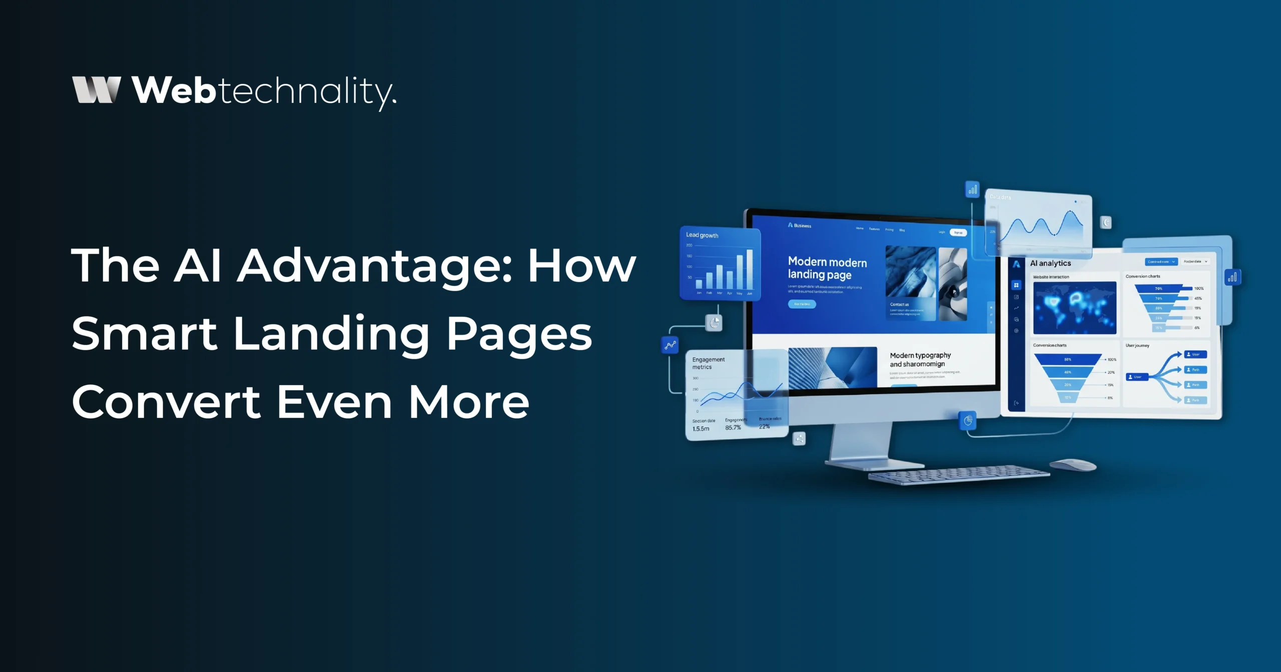
The AI Advantage: How Smart Landing Pages Convert Even More
In 2026, the highest-performing landing pages go beyond static design. They use AI to personalize the experience for different visitor types, capturing leads that a one-size-fits-all page would lose.
Dynamic Headline Personalization
AI personalization tools can detect the traffic source, geographic location, device type, or returning visitor status and dynamically change your landing page headline to match. A visitor from a Google ad for “B2B web design” sees a different headline than a visitor coming directly from a LinkedIn post about AI features. This level of message match dramatically improves relevance and conversion rates compared to a single static headline.
Intelligent Chat Capture
An AI chat agent deployed on your landing page catches visitors who are interested but not ready to submit a form. When a visitor has been on the page for 60 seconds without converting, the chat agent can proactively ask a qualifying question: “Is there anything specific about our process you’d like to know before reaching out?” This interaction frequently converts visitors who would otherwise leave, and it qualifies them simultaneously.
Exit-Intent Optimization
AI-powered exit-intent tools detect when a visitor is about to leave through cursor movement patterns and scroll behavior, and trigger a targeted message before they go. A well-designed exit-intent offer (a lead magnet, a compelling question, a different CTA framing) consistently recovers 5 to 15 percent of visitors who would otherwise leave without converting.
According to a 2026 Optimizely study, landing pages with AI-driven dynamic content personalization convert at an average of 2.7 times the rate of equivalent static landing pages for the same traffic source and offer type. The gap between personalized and static pages is growing as AI tools become more accessible.
Common Landing Page Design Mistakes That Kill Conversions
Even well-intentioned landing pages frequently contain design decisions that work against conversion. Here are the most common ones we see when auditing underperforming pages.
- Auto-playing video or audio: Unexpected sound is one of the fastest ways to lose a visitor, especially on mobile, where they may be in a public space. Always default to muted with a clear play button.
- Multiple competing CTAs: Three different CTAs pointing to three different actions create paralysis. One primary action, repeated consistently, consistently outperforms multi-CTA approaches.
- Vague value propositions: “We help businesses grow” tells a visitor nothing actionable. Every claim should be specific and tied to a measurable or concrete outcome.
- Social proof without specifics: “5-star rated company” with no context is meaningless. “47 client reviews averaging 4.9 stars on Google see why businesses in Arizona trust Webtechnality” is credible and citable.
- No mobile optimization: A page that looks perfect on desktop but is broken, cluttered, or slow on mobile is losing the majority of its potential leads in 2026.
- Asking for phone numbers without explanation: Many visitors are reluctant to provide a phone number if they are not sure how it will be used. “We will only call during business hours and never share your number.” Directly below the phone field can meaningfully increase submission rates.
- No thank-you page or confirmation message: After a form submission, the visitor should immediately know what happens next. A confirmation page that sets expectations, “We will reach out within one business day,” reduces buyer’s remorse and improves show rates for discovery calls.
Frequently Asked Questions
What makes a high-converting landing page?
A high-converting landing page has a specific benefit-led headline that speaks to the target visitor, a single clear call-to-action, relevant social proof adjacent to the conversion point, a simple form with minimal fields, fast load times, and a design that eliminates every distraction from the primary goal.
How many CTAs should a landing page have?
A landing page should have one primary CTA repeated 2 to 3 times throughout the page above the fold, after the main benefits section, and at the bottom of the page. Multiple different CTAs competing for attention consistently reduce conversion rates due to decision paralysis.
What is the ideal length for a landing page?
Landing page length should match the complexity of the offer. Simple offers with warm audiences convert best with short pages. Complex B2B offers or cold traffic typically require longer pages that address objections, provide proof, and build trust before asking for commitment. Length is less important than whether every section earns its presence.
Does page speed affect landing page conversion rates?
Yes, significantly. A 1-second delay in landing page load time reduces conversions by 7 percent or more on average. On mobile, pages that take more than 3 seconds to load lose 25 percent or more of visitors before they even see the offer. Speed is a conversion variable, not just a technical consideration.
Should I use video on my landing page?
Video can significantly increase conversion rates when used correctly. An explainer or testimonial video placed above the fold can increase conversion rates by 80 percent or more compared to text-only pages for the same offer. Keep the video under 2 minutes, ensure it does not delay the rest of the page from loading, and do not make it the only conversion path on the page.
What trust signals should a landing page include?
The most effective trust signals are specific client testimonials with names and companies, quantified case study results, recognizable client or partner logos, professional certifications or awards, security badges near the form, years in business, and the number of clients served. Specificity consistently outperforms generic claims.
Can Webtechnality design a high-converting landing page for my business?
Yes. Webtechnality designs and builds landing pages specifically engineered for lead generation, with conversion-focused copy, trust signal placement, optimized form design, and optional AI personalization features. We build for measurable results, not just aesthetics. Book a free consultation to get started.
The Bottom Line
A landing page that generates leads is not a lucky accident. It is the result of applying deliberate design principles to every element from the first word of the headline to the final field of the form. Every tip in this guide is a friction-removal or persuasion-addition decision that compounds with the others to move the conversion needle measurably.
The businesses with the highest-converting landing pages did not build them perfectly on the first try. They built them with the right principles in place, measured the results, and optimized systematically over time. That process, done deliberately and continuously, is what separates a page converting at 2 percent from one converting at 11 percent. Both are possible with the same traffic. The difference is in design.
Your Immediate Action Plan:
- Rewrite your headline to be specific to one audience and one outcome
- Move your primary CTA above the fold on both desktop and mobile
- Remove navigation links from your primary landing pages
- Add one specific testimonial with a measurable result directly above your form
- Remove two fields from your contact form today
- Check your mobile load speed and address anything over 3 seconds
Build a Landing Page That Converts Traffic Into Leads
Webtechnality designs landing pages built around your specific audience, your offer, and your conversion goals — with every design decision backed by conversion data. Let us build yours.
Schedule Your Free Landing Page ConsultationAbout Webtechnality
Webtechnality is a full-service digital agency based in Kingman, Arizona, specializing in web design, landing page optimization, conversion rate optimization, AI development services, and digital marketing. With 10+ years of experience and 5,000+ projects delivered, we help businesses turn their website traffic into qualified leads and measurable revenue.